Creating My Own Font
June 6th, 2022
Hey howdy! If you're just looking for a link to my font, you can find it right at the bottom of this page!
So, for a good long while I've been wanting to make a font. Like, for years at this point honestly, but I never really had a solid idea so I kept going to it and giving up quite fast. But recently, I was thinking about getting a VCR for multiple reasons. One is for, well, aesthetic purposes for my art. The second being... well, using it as an actual friggin VCR. But the third was to make my own VCR font!
There already exists other VCR fonts, the one you might be most familiar with is VCR OSD Mono. It's a font I've used plenty of times in my own art and I do quite like it, but there's been some shortcomings with it that have frustrated me, like the lack of special characters that Unicode has support for, such as media controls and whatnot that you might find on an actual VCR's font.
Unnessecary Planning
So before I started all of this, I used Joplin (a note-taking program basically) to plan out how I'd make this font. A few ideas I had in mind were to get a VCR that met one of these conditions:
- Built-in CC decoding
- Had a video titler ability
- Allows you to input a title for a show via the programming feature
- A good options menu with lots of text
I'll tell how I did it in the next section, but for now these were my ambitions; to find a VCR like this. There's just a few problems with this however. For one, just finding a VCR that would match these specifications. Which, wasn't easy since even with the advent of the internet, instruction manuals for these VCRs are not guaranteed. Hell, finding the VCR's model from an eBay listing is a gamble in of itself. It's not usually put in the title, it might be in the description, and if not any of those, there's a slim chance that the person took a clear picture with the label.
Then, if you can find a manual, good luck combing through it. Unless it's a Sony model, chances are the scans made of it won't have text you can easily press CTRL+F to find. So you'll have to do it the old fashioned way: By actually reading. And of course there's no guarantee you'll find a single thing relating to any of this!
I did search through these, and ended up listing like, two entire VCRs that I might buy in my journal. One was a Sony SLV-N81, to which... I didn't write down why I wanted it, I instead wrote down reasons not to get it. And the other was a Phillips vrb613at, which... same thing happened here. For both of them, neither had built-in caption decoding (which I would soon find out never existed in any VCR!), and didn't have any option for arbitrary text input, i.e. the aformentioned video titler or programming feature.
Some actually nessecary planning
Despite all of the above, I did actually do some planning that helped me get this done a lot quicker when I finally had the means to do this. One thing I did was, I wanted it to at least out-match VCR OSD Mono, my previously used font. So, I found a way to extract all of the characters that font used! ...problem is, I don't remember how I did it now! I just happen to have a list of all the characters, and forgot how I got that list. By this point, all I remember is I tried a python script, and a bash script. I don't know which one worked since they produce different results.
Another thing I did was write down which programs I'd use, which the top contender was FontForge. I ended up going with this, since it was complex enough to do my task, while also not being overwhelming. Oh, also, it's open-source, which is always nice.
And finally, despite not finding any VCRs with most of the specifications I listed above, I did pick out one that seemed to have a lot of text on screen, under the assumption that if I didn't get all of them, I'd at least have a good starting point to base my work off of.
Oh, and one last thing, I wanted to make a name for this font. I didn't know what to pick, so I stuck with a codename of "Jazz" for this. It uh... ended up being the final name for this, since it's kinda cool. Yes it's a nickname for my name, but shush! It sounds cool okay?
It all starts with this... a VCR
So, now we skip to a couple weeks ago. I went searching for a working VCR, and saw a listing on ebay for a Panasonic PV-V4521. The listing clearly showed pictures of the VCR in working condition, going so far as to connect it to a monitor to demonstrate that. One of the pictures showed text being displayed on it, saying this:
TO SET SPECIFIC REC TIME
PLEASE PRESS REC KEY
And above that was "REC" in text that was twice the size of that, which made me think a bunch of things. Number one is that this VCR most definitely has a complex options menu, since this would have built-in programming of TV shows (i.e. you set a specific time for when the VCR would record your favorite show, and on what channel, etc. just typical VCR stuff). And second, since there was scaled-up text, they went through the effort of getting a chip that can render text like this, meaning there was probably a good chunk of it available to look at.
So, needless to say, I went with this, though honestly it was mainly because of the fact it was clearly shown working; I had 2 (technically 3) VCRs before this that... didn't work. Now comes June 2nd, my VCR arrives, and it all works! I use it to play back some tapes, and I then use it to record... my art onto a tape. Because aesthetic.
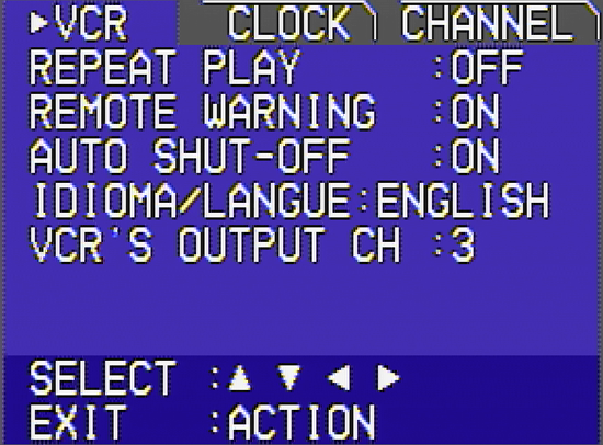
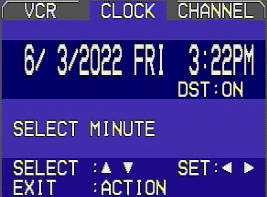
The day after it arrives, a thought comes to me. I thought back to how I wanted to get a VCR to make a font, in which, that's part of why I bought this. So, I hook up the VCR to my A/V capture card, and start fiddling around with the menus. And boy, the menus were loaded with text. Here's just a couple images showing the menu system, because I find it interesting.
So, I decided to write up a python script to do multiple things for me. For one, I wanted to figure what unique characters are in each screenshot, so I took like, 40 screenshots, and documented all of the text on there. Then, in python, I found out how to extract each unique character found in a string, so I slapped together something quick, and found a way to sort it all alphabetically, and got a result with many characters! In fact, the entire English alphabet was there! ...except for Z. But I found a phrase in French that contained the letter Z, so I captured that and I was good to go.
Next, I took the aformentioned list of characters that VCR OSD Mono has, and slapped it in here, and found a way to compare these two. My ultimate goal was to surpass VCR OSD Mono, so, I made it output what characters I've done so far, what characters VCR OSD Mono has, and subtract the difference to show what characters I have left to do. By this point, all of the screenshots combined yielded a total of 50 unique characters. Meanwhile, VCR OSD Mono has... 205. That's a lot.
Now we draw it!
So, now on to what programs I used. I used GIMP for the pixel art. In which, to give a comparison, that's like using a chainsaw to cut a stick of butter. But I didn't really have any other choice, I would've preferred to use paint.NET, but even old versions of paint.NET no longer work on WINE for some inexplicable reason, and I'm not about to suffer with Windows just to use an art program. There are alternatives that claim to be just like paint.NET, but... they're bad.
So GIMP it is! I've eventually learned how to manage with it, and there's even nifty features like being able to set a custom grid pattern to snap to; for this project I chose a 2x2 pixel grid. The technical reason as to why is that it seems the VCR automatically doubles the size of all text on screen; which is good since it'd be tiny otherwise. Most text seems to be 10x16, which in turn makes the captures I've taken be technically 20x32. However, characters that require accents (i.e. the only two that I was able to find, Ç and Ñ) take up more space on screen, it basically becomes 10x19, or 20x38. No other characters have a resolution like this, I'm presuming because it'd take up way more space on the graphics ROM used for this.
So, with that in mind, I created a grid. The grid consists of a 10x16 pattern at the bottom, with a 10x3 grid on top that intersects with the main grid. There's 1 pixel that is shared between these; whenever there's a character with an accent, the letter gets shrunk down by 1 pixel to give the accent more room to breathe. I ended up making extensive use of layers here, so there's 3 main layers this project ended up using. The grid is in the background, in front of it would be screengrabs of my VCR, cropped to fit in this grid. And finally, the pixel art above, where I'd meticulously trace the art.
I ended up drawing a lot more than I thought I would; as I said earlier, there ended up being 50 characters the VCR had, in which I tried my best to faithfully recreate them. It was a bit tricky due to the analog noise making things fuzzy, but in the end I managed. I did make sure to add my own takes to it, like crossing the 0 so that it's more distinguished from a capital O, and such. But in the end I also had to draw 150+ unique characters not found anywhere in the VCR itself; admittedly some of them, like accented capital letters, was mostly a copy/paste job, but those are still not found anywhere on the VCR captures I've taken.
And now, a usable font file!
And now, on to the font program. I chose FontForge since, although it's complicated to use, it ended up doing everything I would need in the end. I was going to initially pick YellowAfterlife's Pixel font converter, since I have used their tools in the past (TerraSavr and The Ministry of Fancy Text), however I could never get it to make a proper font for the life of me. And when I plugged it into FontForge later, I found out why; the text is all wonky with the ascent and descent settings set all wrong!
I won't bore you too much with what I did in FontForge, but all things considered I was able to fudge things to work quite well with this. I set the ascent setting to match my pixel grid in GIMP, set the descent settings to 0 (this font won't go below the line), I then exported all of my pixel art to Inkscape, and converted each individual letter into an SVG. I'm thankful I have used Inkscape for years, since I was able to work my way through this part quite easily. I then go into FontForge, import the SVG, and adjust them to fit. FontForge includes a useful feature where you can give each letter backgrounds, this is used to line it up. I ended up using the same pixel grid I made for GIMP to do it on here, just so I can match it up perfectly. And since the resolution of the font is so low, it ended up being a breeze.
After all of this, I change the ascent setting from 76 to 1024, to make it a power of 2. FontForge complains about it otherwise, and as such I listen to it. It automatically scales up all of the letters for me to their proper positions and such, and then, I export it all as a .TTF file. And.. boom, font made!
Throughout this, I used a webapp called FontDrop! to help me see how far I'm going along; without this I would've been on the wrong track for a good long while each and every time I set up my settings wrong. And of course I'd test my own font in Inkscape, since this is where I'd ultimately use it the most!
The end result
{([ VCR Jazz Mono ])}
4-HEAD Hi-Fi STEREO
⏸⏹🖭⏏⏺
And so, I did it! Within the timespan of 3-ish days, I went from getting a VCR, to creating a font inspired from it! Of course I did have some planning before-hand to help me out with this, but all the drawing, and learning FontForge and such, took place within 2 days!
I had lots of fun making this, and I plan on updating this to add more characters to this font, since I'm definitely not done just yet. I wanna try to get all of the ASCII characters on here, since that'd be neat to have.
The entire character set
!"#$%&'()*+,-./0123456789:;<=>?
@ABCDEFGHIJKLMNOPQRSTUVWXYZ[\]
^_`abcdefghijklmnopqrstuvwxyz
ÀÁÂÃÄÅÆÇÈÉÊËÌÍÎÏÐÑÒÓÔÕÖØÙÚÛÜÝ
Þßàáâãäåæçèéêëìíîïðñòóôõöøùúû
üýþÿĜĝŞşŢţƒƑŠšŽžŒœµ{|}~¡¢£¥¦¨
«©®℗°²³¹»¼½¾¿—•…‹›⁄₣₤₧€™←↑→↓↔−
⏏⏸⏹⏺▲▶►▼◄⏾⏻⏯⏮⏭⏪︎⏩︎☹☺☻㏂㏘×♪♫÷ªº♥
¬±¤🎙🖭📻︎💿︎📀︎💽︎🎮︎⧈⊚🛰📺︎💾︎
Gimmie the link to the font!
Click here to download!
License: SIL Open Font License v1.1
MD5: 188807610b00a1dd60f972428c67051d
SHA256: b9c0d3fc33b1427821a5f84d64d7e4aa841eb42f86b6b293a46a35f569f46fd7
UPDATE 3.2 was released on December 21st 2025!
Someone paid me money to add ♥, so I complied. Simple as that :p
UPDATE 3.1 was released on July 21st 2022!
Changelog is simply that I fixed the space character showing up as an invalid character in some programs (OBS, KDE'S Font Viewer, etc.)
UPDATE 3.0 was released on June 20th 2022!
Changelog:
- Added the following Unicode characters: 🎙℗📻︎💿︎📀︎💽︎🎮︎⧈⊚🛰📺︎💾︎
- Most of these were added to complement 📼🖭, in that these could be interpreted as inputs for a VCR, or for media to be used in a camcorder device.
UPDATE 2.0 was released on June 7th 2022!
Changelog:
- Updated the metadata a bit to have my full name and online name.
- Added the following Unicode characters: ⏾⏻⏯⏮⏭⏩︎⏪︎ƒƑ×♪♫÷ªºŠšŽžŒœ¬±µ¤
- Updated the appearance of the following: ₤€₣£¥
v1.0 can be downloaded here, if you need it!
v2.0 can also be downloaded here!
v3.0 is also found here!
v3.1 is here too!

